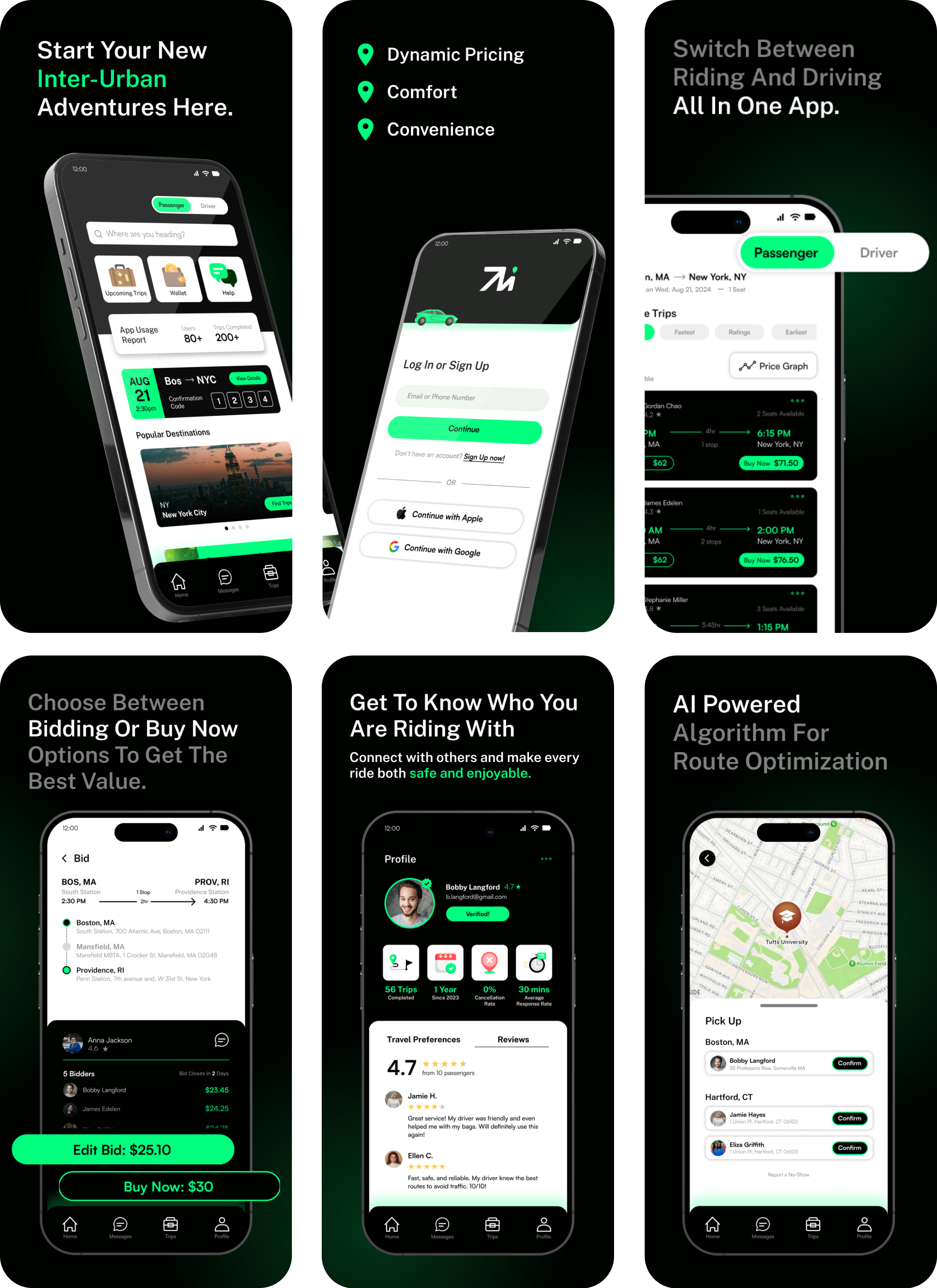
Movelz transforms the way people travel between cities. While long-distance trips are often expensive, inconvenient, and uncomfortable, Movelz provides an affordable and user-friendly alternative. By connecting travelers moving in the same direction and using dynamic pricing to balance cost and convenience, the app creates a personalized rideshare experience, offering a smarter, more comfortable solution compared to traditional bus travel.
Projects Duration: 1.5 years
Role: Lead Product Designer
Tools: Figma, Figjam, Photoshop, Illustrator
Team: Frontend & Backend Dev, Marketing Team
Explore Movelz in App Store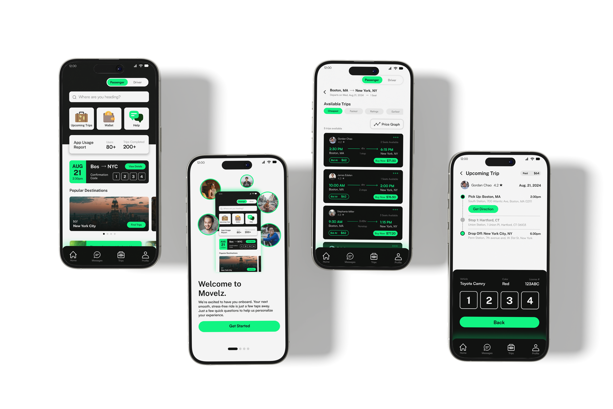
.png)
The core challenge was that the app needed to serve two distinct user groups, drivers and riders, within the same platform. My goal is to build a scalable design system that could support two different user journeys while maintaining brand consistency, usability, and a seamless overall experience.
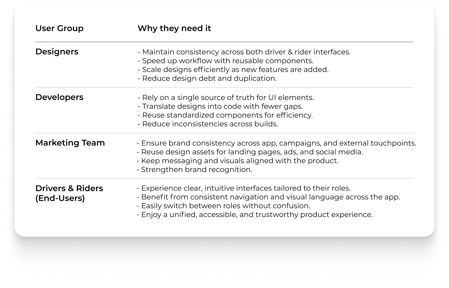
Team & Stakeholders – Define contributors and end-users (designers, developers, product team, drivers & riders).
Audit & Analysis – Review screens to identify inconsistencies and map driver vs. rider needs.
Framework & Structure – Establish tokens and role-specific cues for consistency and clarity.
Design & Iteration – Prototype, test role-switching, and refine with team feedback.
Systemization & Documentation – Deliver scalable guidelines and reusable components.
.png)
.png)
.png)
The Movelz design system balanced consistency and differentiation by giving drivers and riders tailored yet cohesive interfaces, supported by shared tokens and role-specific cues. A clear toggle enabled seamless role-switching, while system documentation aligned designers and developers around a single source of truth. Built for scalability, the system ensures future features can extend without breaking consistency, delivering a unified and intuitive experience for both user groups.
I began by reviewing existing Movelz app screens to identify inconsistencies in typography, color, spacing, and components. I documented which patterns worked well, flagged areas of friction like duplicated elements and unclear hierarchy, and compared driver vs. rider flows to determine where differentiation was needed and where shared solutions could unify the experience.
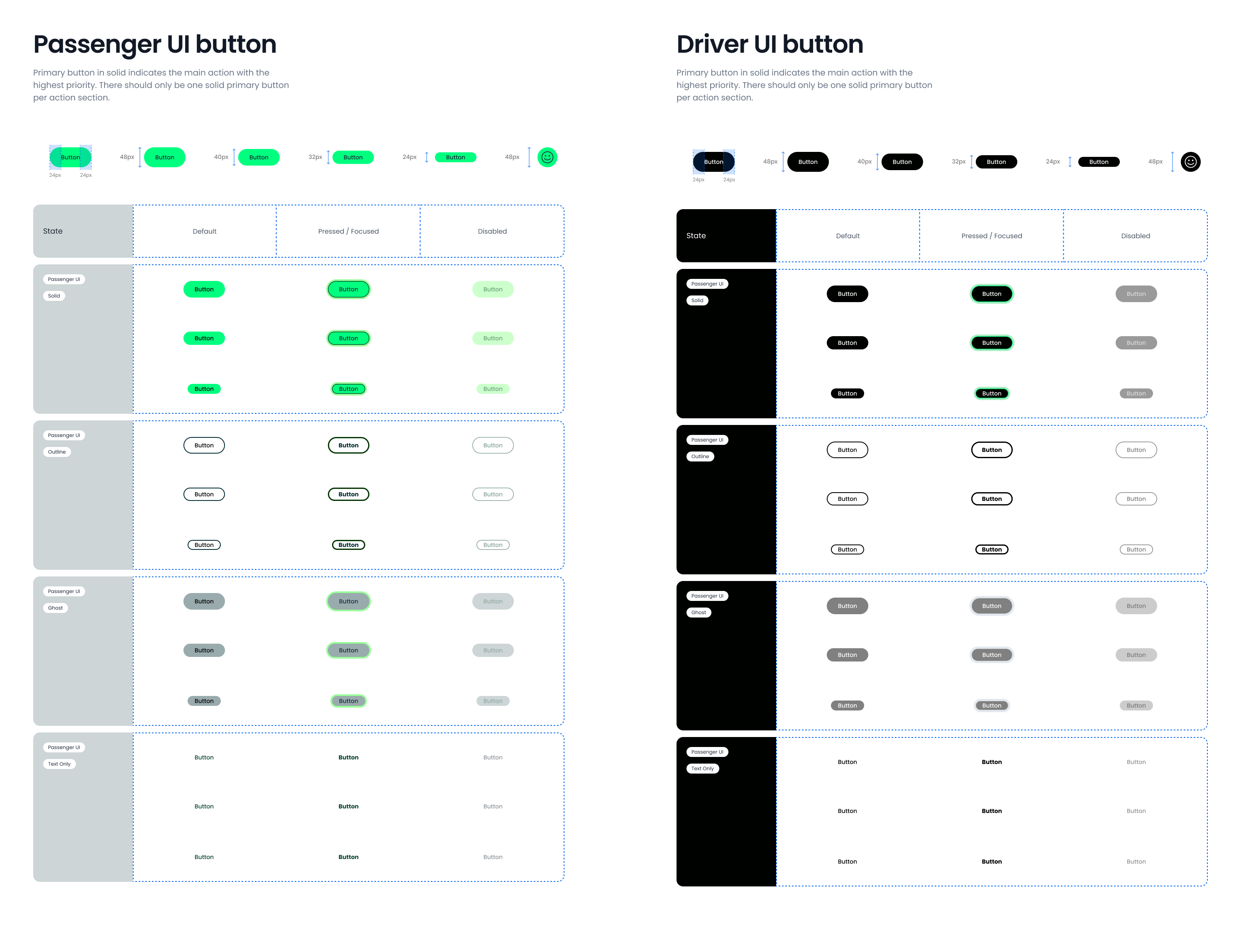
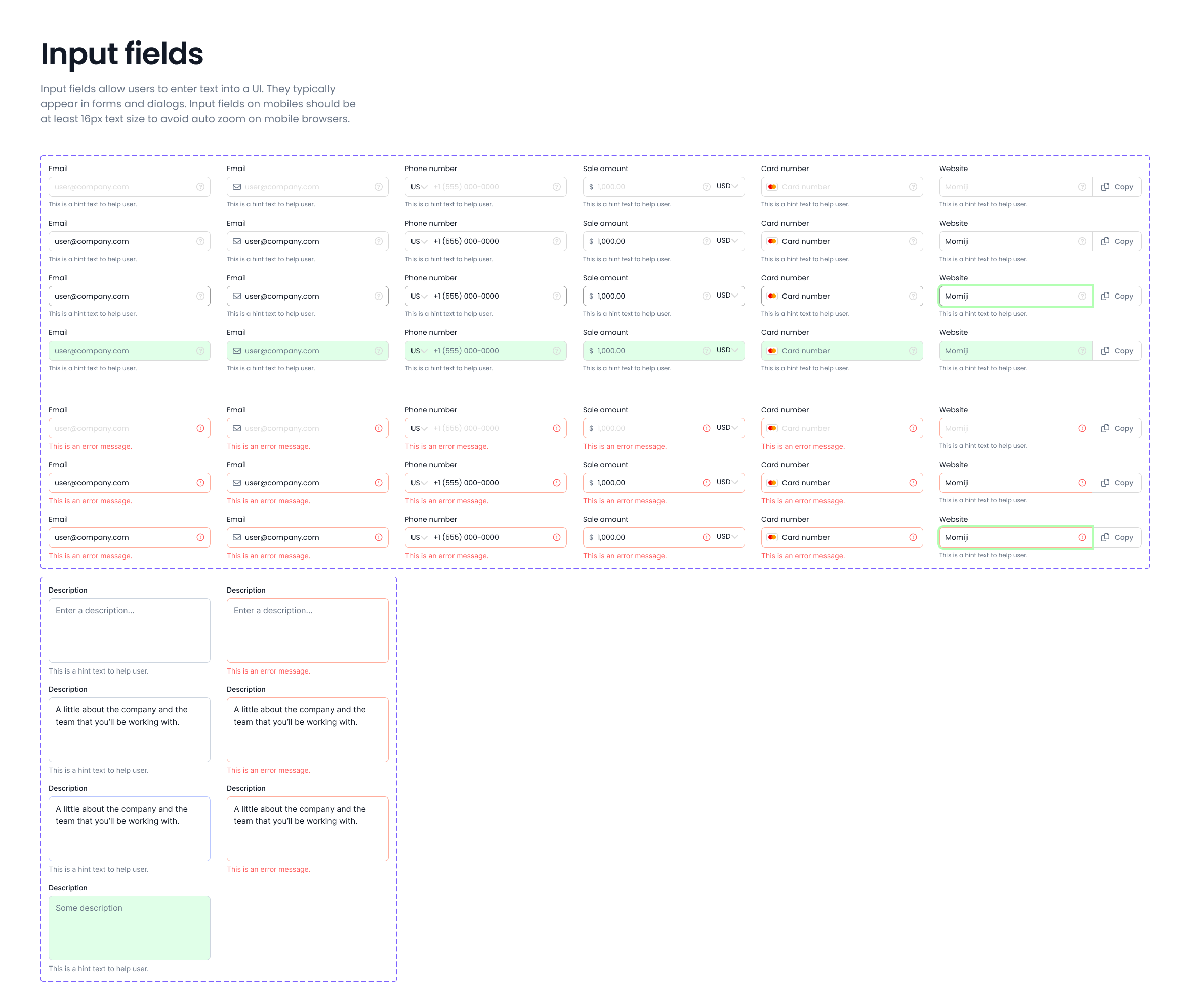
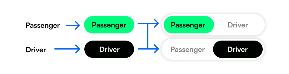
Before developing a full design system, I first focused on identifying the key visual cues that guide users between the passenger and driver experiences. Once those distinctions were clear, I established a token naming structure to ensure consistency, scalability, and clarity across both interfaces in the same app.
.png)
On the passenger side, this color signals “go” and creates an intuitive sense of safety when booking rides. Its vibrancy inspires optimism and energy, while reinforcing Movelz’s eco-friendly mission to reduce CO₂ emissions. To ensure accessibility, additional darker and lighter shades of green are introduced, providing enough contrast for text, icons, and states, so every user, regardless of ability or device, can interact with the interface clearly and confidently.
The driver side uses black to convey professionalism, reliability, and focus. Its neutral tone ensures clarity for task-driven interactions, while also creating a strong contrast against the bright green of the passenger side. This distinction helps drivers and riders instantly recognize their interface, while both remain unified under the Movelz brand.
.png)

%20(1).png)

.png)
With the design system in place, simple elements like text, shapes, and icons can seamlessly scale into larger components and UI patterns, ensuring consistency, efficiency, and long-term scalability.

Working on the Movelz design system with a cross-functional team taught me how valuable it is beyond design, developers, marketers, and designers each rely on it in their own way. I learned how it creates alignment and makes everyone’s work more efficient. Next, I want to explore different use cases and expand the system into something more sophisticated and adaptable.
increase in task
success rates from users
drop in design-to-dev revisions
of new screens were built using standardized components
.svg)
